
20 Stunning Pastel Wall Colors to Transform Your Home
 Admin
Admin
- 10th Mar 2025
- 1169
- 0

Never miss any update
Join our WhatsApp Channel
Table of Contents
- What Makes a Color Pastel?
- Why Pastels Rock for Home Walls
- 20 Must-Try Pastel Paint Colors
- Cool Ways to Use Pastel Colors
- How to Make Pastel Walls Work with Your Stuff
- Pastel Colors and Vastu (Ancient Design Science)
- Finding Your Perfect Pastel
- Pro Tips for Decorating with Pastel Walls
- Bottom Line: Pastels Are Awesome
Let's face it - choosing wall colors can be super tricky. But pastels? They're game-changers. These soft, dreamy shades don't just look pretty - they make rooms feel bigger, brighter, and way more inviting. Whether you're redoing your whole place or just sprucing up one room, pastels offer that perfect mix of style and chill vibes that other colors just can't match.
What Makes a Color Pastel
Pastels aren't complicated - they're just regular colors mixed with white until they reach that soft, cloud-like look. While most folks think of baby blue or light pink, pretty much any color can become a pastel with enough white added. This means endless possibilities for your walls!
Where do pastels hang out on the color wheel? It depends on their original color:
- Pinks and peachy tones come from red
- Light blues come from the cyan and aqua areas
- Soft yellows live in the lemon section
- Lilacs and lavenders start as purple
- Mint and sage come from green
- Soft oranges show up as apricot and coral
Why Pastels Rock for Home Walls
There's good reason pastels are so popular:
- They make small rooms feel bigger - Light colors create an optical illusion of space
- They're natural light boosters - Pastels reflect light better than dark colors
- They play well with others - They work in any room and with most furniture
- They don't go out of style - Unlike trendy bold colors that you might hate next year
- They're good for your mood - Soft colors help you relax and feel less stressed
- They're super flexible - You can pair them with neutrals or bolder accent colors
20 Must-Try Pastel Paint Colors
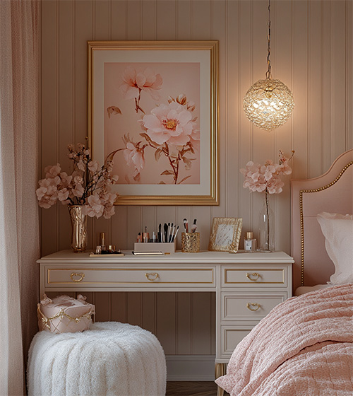
1. Blush Pink
Once just for kids' rooms, this soft pink has grown up! Now it's a sophisticated choice for living rooms and bedrooms that adds warmth without screaming "pink!" It creates this subtle romantic vibe that works with tons of different styles.
Where it works best: Bedrooms, living rooms, dining areas
Pairs great with: Gray, white, gold accents, navy blue
Pro tip: Add some gold or brass accessories to make it feel luxe, not childish
2. Lavender Mist
This dreamy purple creates instant calm. Unlike darker purples that can feel heavy, lavender feels light and airy - perfect for spaces where you want to relax.
Where it works best: Bedrooms, bathrooms, chill-out spaces
Pairs great with: White, silver, light gray, cream
Pro tip: Mix in some velvet pillows or fuzzy throws to add texture and depth
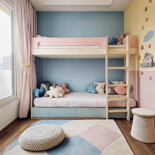
3. Sky Blue
Think of clear summer skies - that's what this color brings to your walls. It feels open, fresh, and super clean without being boring.
Where it works best: Bathrooms, kitchens, home offices, bedrooms
Pairs great with: White, sandy beige, soft yellow, light gray
Pro tip: Use in rooms that don't get much natural light - it'll make them feel brighter
4. Mint Green
This refreshing shade brings outdoor vibes inside. Mint makes spaces feel healthy and alive - it's like having plants without the responsibility of keeping them alive!
Where it works best: Kitchens, bathrooms, sunrooms, home offices
Pairs great with: White, wood tones, coral, navy
Pro tip: According to Vastu (ancient design wisdom), green promotes good health, so it's perfect for spaces where wellness matters
5. Butter Yellow
This happy color brightens up spaces without being too in-your-face. It's especially amazing in rooms that don't get much sunlight - it's like having sunshine year-round.
Where it works best: Kitchens, breakfast nooks, north-facing rooms
Pairs great with: White, navy blue, light gray, wood tones
Pro tip: Great for spaces where people gather - it encourages good conversation and happy vibes
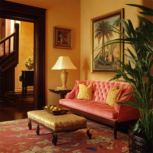
6. Peach Whisper
Way more grown-up than bright orange, peach adds warmth without going overboard. It creates this welcoming feel and makes everyone's skin look amazing (bonus!).
Where it works best: Living rooms, dining areas, entryways
Pairs great with: White, teal, navy, soft green
Pro tip: Add some real plants - they look awesome against peach walls
7. Cloud Gray
This isn't your boring gray - it's the lightest possible shade that offers subtle dimension while staying neutral. It works with literally everything while adding more interest than plain white.
Where it works best: Living rooms, bedrooms, home offices, dining rooms
Pairs great with: Literally anything - it's that versatile
Pro tip: Add textured furnishings so the gray doesn't fall flat
8. Soft Sage
Bringing nature inside, soft sage feels calming and grounded. It works as a sophisticated neutral that adds personality without taking over.
Where it works best: Bedrooms, living rooms, kitchens
Pairs great with: White, cream, terracotta, navy
Pro tip: Mix in natural materials like wood, stone, and linen for earthy vibes
9. Pale Aqua
With hints of blue and green, pale aqua creates beachy, vacation vibes. It feels refreshing and relaxing at the same time.
Where it works best: Bathrooms, bedrooms, sunrooms
Pairs great with: White, sandy colors, coral, navy
Pro tip: Layer different blue-green shades for a tranquil, oceanside feeling
10. Lilac Frost
A bit cooler than lavender, lilac frost adds modern sophistication to your walls. It brings a contemporary feel while staying elegantly timeless.
Where it works best: Bedrooms, home offices, formal living areas
Pairs great with: Gray, silver, white, deep purple accents
Pro tip: Balance with warm metals like brass to prevent the space from feeling too cool
11. Ballet Slipper Pink
Lighter than blush but warmer than white, this barely-there pink adds the tiniest hint of warmth. It's like the no-makeup makeup of wall colors - subtle but effective.
Where it works best: Bedrooms, fancy living rooms, dressing areas
Pairs great with: Gray, charcoal, navy, gold
Pro tip: Use as a background that lets your statement furniture or art be the star
12. Celadon
This historic green with gray undertones brings old-world elegance to modern spaces. It's sophisticated without trying too hard.
Where it works best: Dining rooms, living rooms, bedrooms
Pairs great with: White, navy, burgundy, gold
Pro tip: Looks amazing with antique furniture for that collected-over-time look
13. Powder Blue
A classic that never goes out of style. Powder blue feels traditional yet fresh and clean.
Where it works best: Nurseries, bathrooms, bedrooms
Pairs great with: White, chocolate brown, brass, cream
Pro tip: Try it on ceilings instead of white for subtle impact
14. Pale Coral
More grown-up than pink but warmer than peach, pale coral adds energy without overwhelming. It creates a vibrant yet refined atmosphere.
Where it works best: Dining rooms, living rooms, powder rooms
Pairs great with: Navy, white, emerald green, gold
Pro tip: Looks absolutely magical in rooms with lots of natural light
15. Buttercream
Not quite yellow, not quite cream - buttercream offers warmth that reads as cozy and inviting rather than obviously colored.
Where it works best: Living rooms, kitchens, dining areas
Pairs great with: All wood tones and basically any accent color
Pro tip: Perfect alternative to white in rooms with northern exposure (which can feel cold)
16. Dusty Rose
More sophisticated than pink and less purple than mauve, dusty rose brings vintage vibes to modern spaces. It's got character while still being livable.
Where it works best: Bedrooms, dining areas, formal living spaces
Pairs great with: Navy, gray, gold, olive green
Pro tip: Add velvet furniture for mega luxurious vibes
17. Seafoam
This vacation-inspired color brings coastal relaxation home. Seafoam creates "escape" vibes while still looking grown-up.
Where it works best: Bathrooms, bedrooms, sunrooms
Pairs great with: White, sand, navy, coral
Pro tip: Add natural textures like linen and jute for beach house feels
18. Pale Pistachio
More unique than mint but equally refreshing, pale pistachio offers a distinctive take on green. It brings natural energy without being too expected.
Where it works best: Kitchens, dining areas, sunrooms
Pairs great with: White, terracotta, deep brown, brass
Pro tip: Looks amazing with earthy ceramics and textiles
19. Misty Mauve
Mixing pink and purple undertones, misty mauve creates depth without being heavy. This complex pastel works in both traditional and modern spaces.
Where it works best: Bedrooms, fancy living rooms, dining areas
Pairs great with: Gray, navy, emerald green, gold
Pro tip: Perfect for spaces where you entertain at night - it looks amazing in lamplight
20. Creamy Linen
The palest warm neutral, creamy linen has more character than white while staying super versatile. It makes art and furniture pop.
Where it works best: Anywhere - especially great in open floor plans
Pairs great with: Everything - it's that flexible
Pro tip: Use throughout connected spaces for flow, then add colored furniture and accessories for interest
Cool Ways to Use Pastel Colors
Mix Two Colors Together
Create visual interest by using two complementary pastels on different walls or parts of the same wall. It adds architectural interest without construction work.
Just One Accent Wall
Not ready to go all-in? Try using a pastel on just one focal wall. You get the color pop while keeping other walls neutral.
Get Stripe-Happy
Use painter's tape to create striped effects with two pastels. It adds texture and uniqueness to boring flat walls.
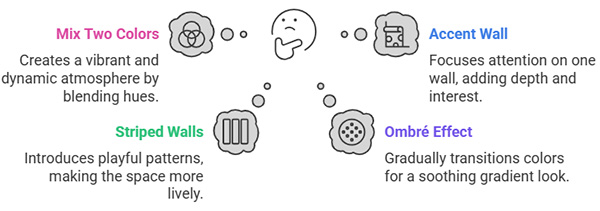
Try the Ombré Thing
Fade from one pastel to another (or to white) for a cool ombré effect that adds serious style points.
Don't Forget the Ceiling
People always ignore the "fifth wall" - a pastel ceiling with white walls creates unexpected wow-factor and makes rooms feel taller.
How to Make Pastel Walls Work with Your Stuff
Furniture That Works
- With pink and purple pastels: Try gray, navy, or natural wood furniture
- With blue and green pastels: Warm woods and white furniture look awesome
- With yellow and orange pastels: Navy, dark gray, or walnut create nice contrast
Fabrics and Soft Stuff
- Add interest with textured fabrics like velvet, linen, and chunky knits
- Look for patterns that include your wall color plus complementary colors
- Layer different shades in the same color family for sophisticated vibes
Art and Accessories
- Pastel walls make bold, colorful art pop like crazy
- Black and white photos look super dramatic against pastel backgrounds
- For a pulled-together look, choose accessories that pick up colors from your walls
Pastel Colors and Vastu (Ancient Design Science)
According to Vastu Shastra (the ancient Indian science of architecture), colors affect energy flow in your home. Here's how pastels work with Vastu:
| Room | Good Pastel Colors | Colors to Avoid |
|---|---|---|
| Kitchen | Butter Yellow, Blush Pink | Black, Dark Gray |
| Bedroom | Sky Blue, Mint Green, Lavender | Bright or Bold Colors |
| Living Room | Butter Yellow, Soft Sage, Pale Aqua | Dark or Intense Colors |
| Prayer Room | White, Pale Yellow, Light Blue | Dark or Intense Colors |
| Nursery | Cloud Gray, Buttercream, Powder Blue | Black, Red, Dark Purple |
| Home Office | Mint Green, Sky Blue, Seafoam | Red, Black, Orange |
Finding Your Perfect Pastel
Think About What the Room's For
Different rooms need different vibes:
- Kitchens: Energetic pastels like yellow, mint, or pale aqua
- Bedrooms: Calming pastels like lavender, sky blue, or soft sage
- Living spaces: Versatile pastels like cloud gray, buttercream, or blush pink
- Bathrooms: Fresh, clean pastels like powder blue, seafoam, or pale pistachio
Check Your Natural Light
The direction your windows face changes how paint looks:
- North-facing rooms: Go with warmer pastels like butter yellow, blush pink, or creamy linen
- South-facing rooms: Any pastel works, but cooler tones like mint, sky blue, or cloud gray balance intense light
- East-facing rooms: Morning light makes warm pastels like peach, butter yellow, or ballet slipper pink look amazing
- West-facing rooms: Evening light intensifies color, so soft pastels like lavender mist, seafoam, or cloud gray work great
Always Test Before You Commit!
Never skip this step:
- Paint big patches (at least 2x2 feet) on different walls
- Look at the color throughout the day
- See how it looks with your furniture
- Check it in both natural light and lamp light
Pro Tips for Decorating with Pastel Walls
- Balance with neutrals: Mix in white, gray, or wood to avoid pastel overload
- Add different textures: Include various textures in furnishings and textiles to create depth
- Include some darker stuff: Add a few darker elements to ground the space
- Think about metals: Choose complementary metals (brass with warm pastels, chrome with cool pastels)
- Bring in natural elements: Plants, natural fibers, and organic shapes balance pastel softness
- Make connected rooms flow: When using different pastels in connected spaces, make sure they play nice together
- Lighting matters big time: Install dimmers to control how pastels look at different times
Bottom Line: Pastels Are Awesome
Pastel wall colors give you personality without overwhelming your space. They bring character while staying versatile enough to work with changing decor trends. By picking the right pastel for your room and pairing it with thoughtful design elements, you can create spaces that feel peaceful, sophisticated, and totally you.
Whether you go with one pastel throughout your home or try different colors in different rooms, these gentle hues create a foundation that'll keep looking fresh and inspiring for years to come.
ALSO READ :-Indian Kitchen Design Ideas: Transform Your Cooking Space with Style & Functionality
ALSO READ :-5 Smart Ways to Revamp Your Home for Comfort and Innovation


Comments
No comments yet.
Add Your Comment
Thank you, for commenting !!
Your comment is under moderation...
Keep reading blogs